If you’ve ever watched a professional artist mix paint and thought, “How did they do that so fast?” you’re not alone. One swipe of blue, a dab of yellow, and suddenly they’ve created the most stunning, vibrant green you’ve ever seen. Meanwhile, your palette looks like a battlefield of muddy browns. Frustrating? Absolutely.
Unfixable? Not at all.
The truth is that professional-looking color mixing isn’t talent, it’s technique. Artists aren’t born knowing how to mix perfect colors. They learn it through experience, trial and error, and a deep understanding of how pigments behave.
This guide breaks down what professional artists actually know about color that beginners usually don’t and how you can start applying those same principles today.
The Illusion of Ease: Why Color Mixing Looks Effortless for Other Artists
When you watch an artist’s speed-paint or observe someone more experienced, you’re seeing the result, not the process. What you don’t see are:
- Years of experimentation
- Countless muddy mixes they’ve made in the past
- Their mental “library” of how pigments react
- Hours spent building color intuition
It’s like watching a chef plate a gourmet dish – beautiful, quick, and precise. But behind it are years of practice, burn marks, and over-salted soups. Artists are no different.
The REAL Secrets Behind Why Artists Mix Colors So Easily
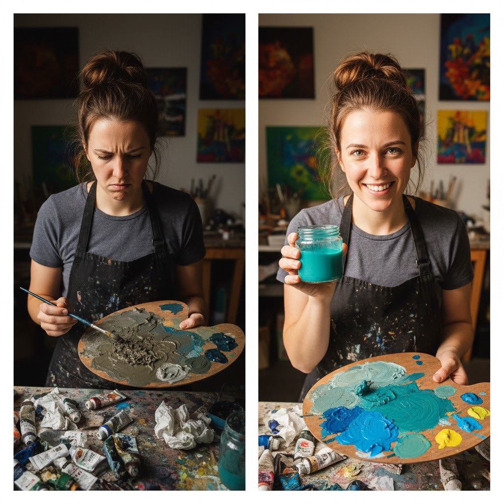
Breaking Down the “Secret”
So, what are these “secrets” that make color mixing seem so easy for others? Let’s dive in:
1. They Understand Their Pigments (Really Well)
This is the heart of great color mixing.
One of the biggest differences between beginners and experienced artists is how deeply professionals understand their pigments. They don’t just know the name on the tube, they know its temperature, tinting strength, transparency, undertone, and mixing behavior.
Each pigment behaves differently, and artists who study these behaviors gain far more control over their color outcomes. For example:
- Some pigments are highly tinting, meaning a tiny amount will overpower a mix.
- Some colors are naturally transparent, making them perfect for glazing but tricky for opaque coverage.
- Others have specific undertones—a red may lean toward orange or violet, affecting every mixture it touches.
- Earth colors like Burnt Sienna or Yellow Ochre can create instant, naturalistic neutrals when paired with specific blues.
Professional artists learn these nuances through practice, swatching, color charts, and years of observation. By understanding their pigments the way a chef understands ingredients, they’re able to mix exactly what they want—clean brights, subtle transitions, or complex neutrals—without guesswork.
When an artist knows their pigments intimately, color mixing stops being trial and error and becomes a deliberate, intuitive art form. Beginners often struggle because they don’t yet understand the personality of each pigment.
Professional artists know that every paint color has unique properties:
- Hue – the base color (red, blue, yellow)
- Value – how light or dark it is
- Chroma/Saturation: How vibrant or dull it is.
- Transparency/Opacity: How much light it lets through or blocks.
- Tinting Strength: How much impact a small amount of that color has when mixed with others.
They know which yellow leans green, which blue is warm, which red is cool, and how each interacts when mixed. Because of this, their color choices are intentional—not random stabs in the dark.
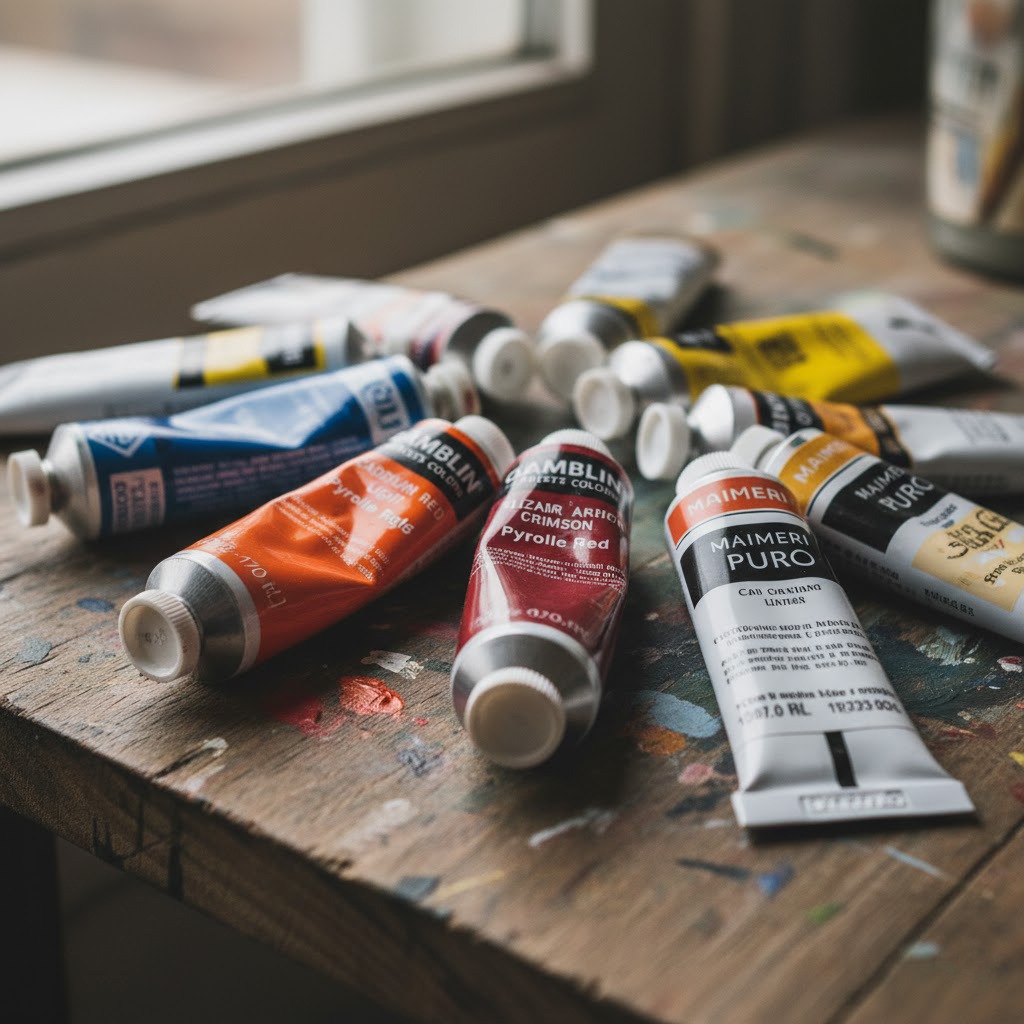
2. They Use Primary Colors (and a Split-Primary Palette)
You probably first learned about primary colors—red, yellow, and blue—back in kindergarten. But what most people don’t realize is that their true power isn’t in how simple they are. It’s in how incredibly versatile they become when an artist understands how to mix them.
Professional artists often rely on a surprisingly limited palette built around these primaries (plus a white and sometimes a black or neutral dark). This deliberate limitation forces them to truly understand how colors interact, what happens when hues lean warm or cool, and how to control saturation, harmony, and mood. In fact, many artists find that mastering a limited palette leads to richer, more intentional paintings than using dozens of premixed tubes.
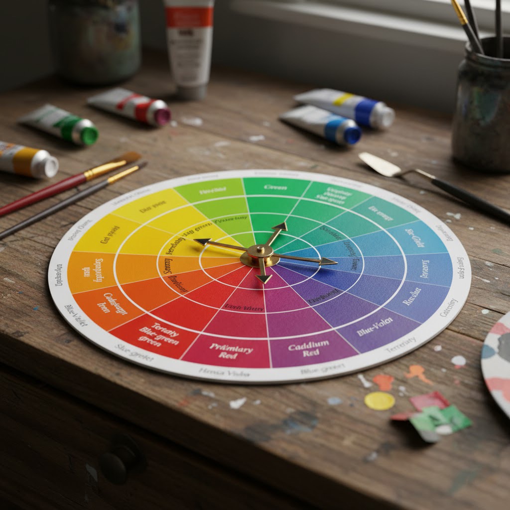
Why a Split-Primary Palette Is a Game Changer
Beyond the basic primaries, most trained artists come to understand the concept of a split-primary palette—a system built around having both a warm and a cool version of each primary color.
This means the palette usually includes:
Reds
- Warm Red: e.g., Cadmium Red, Pyrrole Red
- Cool Red: e.g., Alizarin Crimson, Quinacridone Magenta
Yellows
- Warm Yellow: e.g., Cadmium Yellow Deep, Yellow Ochre
- Cool Yellow: e.g., Lemon Yellow, Hansa Yellow Light
Blues
- Warm Blue: e.g., Ultramarine Blue
- Cool Blue: e.g., Phthalo Blue
This system instantly expands the range of possible mixtures because warm and cool primaries create drastically different results. For example:
- Mixing a cool blue with a cool yellow gives you a bright, clean green.
- Mixing a warm red with a warm yellow gives you vivid, fiery oranges.
- Mixing opposites (a warm blue + a cool orange-leaning yellow) creates beautiful, muted neutrals.
The split-primary palette lets artists decide whether they want mixes that are pure and vibrant or soft and subdued—without accidentally creating the muddy, grayish tones beginners often struggle with.
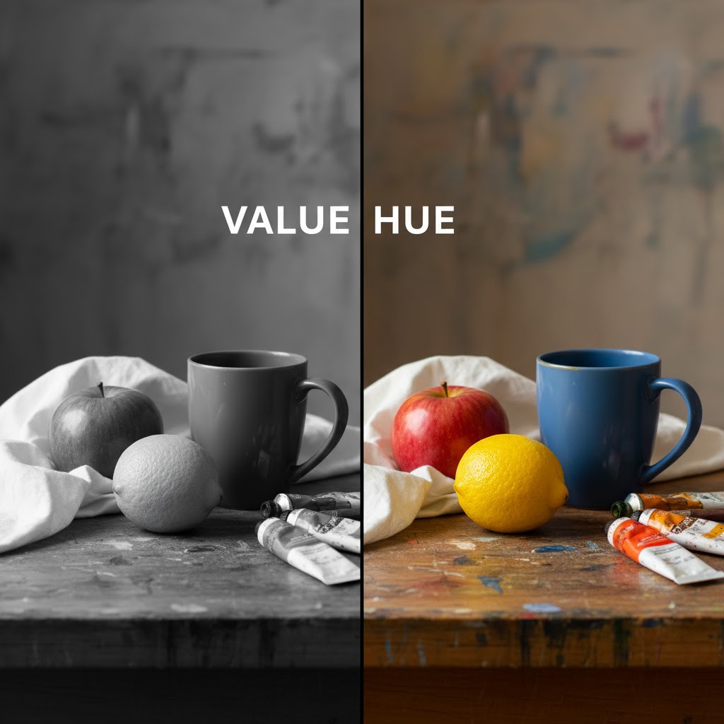
3. They Mix by VALUE First, Then Adjust the Hue
This is one of the biggest beginner mistakes.
Beginners ask:
“How do I get the perfect green?”
Professionals ask:
“How light or dark should this green be?”
Experienced artists often approach mixing in stages. They first focus on getting the value (lightness or darkness) of the desired color correct. Once the value is established, they then adjust the hue and saturation. This method prevents colors from becoming muddy, as muddiness often arises from mixing colors of vastly different values without careful adjustment.
4. They Mix Slowly—Using Tiny Additions and Constant Testing
You’ll rarely see an experienced artist dump a huge glob of one color into another. Instead, they add small amounts, mix thoroughly, and then test the color. This iterative process allows for precise control and minimizes waste. They also use a mixing knife or brush to scrape the mixed color to the side of the palette to see its true hue against a clean surface, rather than being influenced by the surrounding colors on the palate.
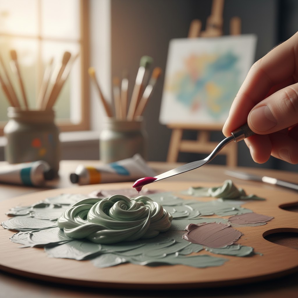
This gives them complete control and dramatically reduces muddy results.
5. They Know How to Use Complementary Colors
Complementary colors are incredibly useful for dulling down or neutralizing a color without making it muddy. A touch of a color’s complement will reduce its saturation, making it more muted and natural. This is how artists create beautiful grays and browns from their existing palette.
Complementary colors (opposites on the color wheel):
- Red ↔ Green
- Blue ↔ Orange
- Yellow ↔ Purple
Professionals use complements to:
- Neutralize overly bright hues
- Create natural shadows
- Tone down colors without turning them gray
- Mix beautiful browns and muted tones
This is how artists avoid the “muddy mess” many beginners end up with.
6. They Practice—A LOT
No secret here. The difference between an “easy” mix and a muddy one often comes down to hours logged.
Professional artists spend time:
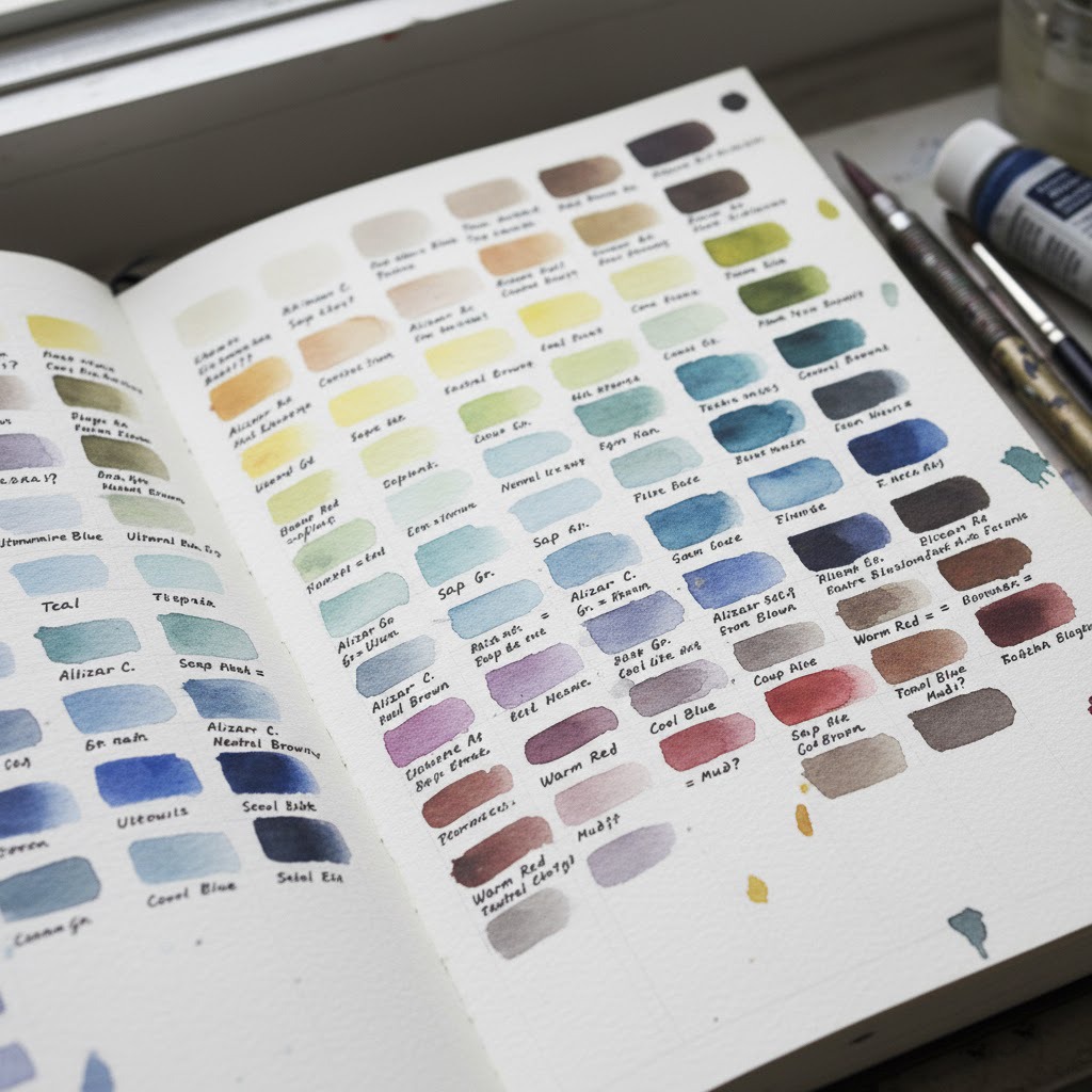
- Making color charts
- Creating swatches
- Testing pigment interactions
- Practicing gradients and value studies
- Observing colors in real life
Color mixing ability is a muscle, one you can train.
Fill a sketchbook with swatches, gradients, and color studies.
Final Thoughts: Color Mixing Isn’t Magic, It’s Method
Every artist you admire once struggled with muddy colors, too. What looks effortless now is the result of knowledge, patience, and consistent practice.
You’re not behind, you’re just at the beginning of the journey.




Add a comment